
The role of paint colour selection in your home
- WM Creative Designs Limited
- Jun 7
- 9 min read
TL;DR:
Paint colour influences mood, cognition, and spatial perception, making it a crucial aspect of home interior design.
Careful testing of large samples under varied lighting and considering undertones and LRV ensures colour choices support the intended emotional and functional purpose of each room.
Paint colour selection is the single most powerful tool a homeowner or decorator has for shaping the psychological atmosphere and aesthetic character of a residential space. Research synthesising neuroscientific, behavioural, and psychological findings confirms that colour affects mood, cognitive performance, social interaction, sleep quality, and long-term well-being. This goes far beyond choosing a shade you like on a chip. The colours on your walls are working on you constantly, whether you notice them or not. Understanding how paint colour psychology operates gives you real control over how your home feels to live in.
How do different paint colours influence mood and emotion?
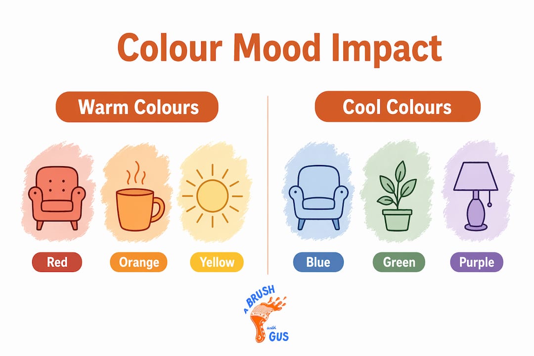
Paint colour psychology is the study of how specific hues and tonal families trigger measurable physiological and emotional responses in people occupying a space. According to research summarised by Verywell Mind, warm colours increase arousal while cool colours reduce it. This is not a matter of personal taste. It is a documented pattern with practical consequences for every room in your home.
Warm colours, which include reds, oranges, and yellows, raise heart rate and stimulate the nervous system. They create energy and encourage conversation, which makes them well suited to dining rooms and social spaces. The risk is that the same stimulating quality can tip into agitation or restlessness in spaces meant for rest. A deep terracotta in a bedroom, for instance, often feels oppressive after a few nights even if it looked striking in a showroom.
Cool colours, particularly blues, greens, and soft violets, lower physiological arousal and promote calm and concentration. Farrow and Ball’s Mizzle, a muted grey-green, and Dulux’s Mineral Mist are popular precisely because they deliver that calming effect without feeling cold or clinical. These tones work well in bedrooms, bathrooms, and home offices where focus or rest is the priority.
Neutrals, including whites, warm greys, and soft beiges, reduce sensory overload and make spaces feel larger and more ordered. They are not passive choices. A warm white with a yellow undertone reads entirely differently from a cool white with a blue undertone, and that difference shapes how a room feels at every hour of the day.
“Colour psychological effects are contextual rather than universal. Lighting, saturation, cultural meaning, and intended use all moderate outcomes.” — Verywell Mind
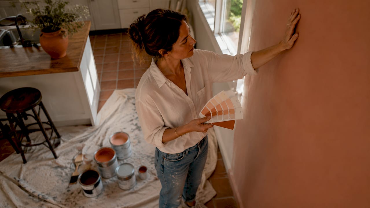
Pro Tip: Do not select a colour based on how it makes you feel in a paint shop or on a screen. The impact of paint colours shifts dramatically once they cover four walls and interact with your specific light, furniture, and flooring.
The effects of colour on mood are also shaped by personal history and cultural associations. Red signals danger in some cultural contexts and celebration in others. This means no colour rule is absolute, but the physiological patterns around warm and cool tones are consistent enough to use as a reliable starting framework.
Why does paint colour look so different on the wall?
The single most common source of disappointment in decorating is choosing a colour from a chip and finding it looks completely wrong once it is on the wall. This happens because abstract colour preference does not transfer reliably to spatial settings. Research using self-report, gaze tracking, and pupillometry confirms that people evaluate colours differently when they are assessing them as environmental surfaces rather than as isolated swatches.

Two technical factors drive most of this mismatch: undertones and Light Reflectance Value.
Understanding undertones
Every paint colour contains undertones, secondary hues that become visible once the paint is applied at scale. A grey that looks perfectly neutral on a chip may reveal a strong purple or green undertone on a wall, particularly under artificial light. Undertones interact with the existing colours in a room, including flooring, upholstery, and woodwork, and can shift the entire mood of a space in ways that are impossible to predict from a small sample.
What is LRV and why does it matter?
Light Reflectance Value is a measurable scale from 0 to 100 that indicates how much visible light a paint colour reflects. A score of 0 absorbs all light, while 100 reflects all of it. This matters because LRV directly predicts how bright or heavy a colour will feel in a real room. A paint with an LRV below 40 will make a north-facing room feel noticeably darker, regardless of how light it appeared on the chip. Most professional decorators treat LRV as a non-negotiable filter when selecting colours for rooms with limited natural light.
LRV range | Perceived effect | Best suited to |
70 to 100 | Very bright, airy, spacious | Small rooms, north-facing spaces |
50 to 69 | Balanced, comfortable | Most living areas and bedrooms |
30 to 49 | Rich, cosy, grounding | Accent walls, large well-lit rooms |
0 to 29 | Heavy, dramatic, absorbing | Feature walls, large spaces only |
Lighting also shifts how undertones read throughout the day. A colour assessed under morning light in a south-facing room will look different again under tungsten bulbs in the evening. Testing paint samples on the actual wall at multiple times of day is the only reliable way to know what you are actually choosing.
Pro Tip: Paint at least two A4-sized patches of each sample colour on different walls in the room, including one near a window and one in a darker corner. Observe them at morning, midday, and evening before making any decision.
What principles guide effective colour selection by room?
Knowing the psychology is only useful if you can translate it into decisions. Designers use a two-step selection approach that prevents the most common mismatches between aesthetic appeal and functional suitability. The first step is selecting the colour family based on the room’s primary purpose. The second is refining saturation and undertones to achieve the right psychological and visual fit.
Here is how that plays out across the most common rooms in a home:
Bedroom. Choose from cool or muted warm tones with an LRV above 50. Soft sage greens, dusty blues, and warm off-whites support rest and reduce arousal. Avoid highly saturated colours, which stimulate the nervous system even at low light levels.
Living room. This space serves multiple functions, so a mid-saturation warm neutral or a grounded earthy tone tends to work well. Terracotta, warm taupe, and soft ochre create energy without overstimulating.
Home office. Muted greens and soft blues support concentration. Research on cognitive performance suggests that cool tones aid focus in work settings, while highly saturated colours of any family tend to distract.
Kitchen and dining room. Warm tones encourage appetite and conversation. Soft yellows, warm whites, and terracotta tones are consistently popular in these spaces for good reason.
Bathroom. Clean whites, pale blues, and soft greens reinforce a sense of hygiene and calm. High LRV values work well here to compensate for often limited natural light.
The 60-30-10 rule is the most practical palette composition framework for achieving visual balance across a home. Sixty per cent of a room’s colour comes from the walls, thirty per cent from larger furnishings and textiles, and ten per cent from accent pieces. This structure prevents visual chaos and ensures the importance of colour choice is matched by a coherent result.
A common pitfall is selecting colours room by room without considering the overall flow of the home. When rooms are visible from one another, clashing colour families create a jarring effect. Choosing a consistent undertone family across the whole home, even when using different hues in each room, creates cohesion without monotony.
How do you test and finalise paint colour decisions?
The importance of colour choice is undermined every time a homeowner makes a final decision from a small chip under shop lighting. Professional colour evaluation involves assessing samples multiple times across different lighting conditions, a practice that prevents the single most expensive mistake in decorating.
Follow this process before committing to any colour:
Apply large sample patches (at least A4 size) directly onto the wall in at least two locations in the room.
Observe the samples in morning light, midday light, and under your evening artificial lighting.
Assess how the colour reads next to your flooring, skirting boards, and any fixed furnishings.
Leave the samples up for at least 48 hours before deciding. Impulse decisions made on the first day are the leading cause of repaints.
Use peel-and-stick sample boards if you want to move the colour around the room or hold it against different surfaces without committing paint to the wall.
The context-sensitive nature of colour preference means that a colour you love in one room may feel entirely wrong in another, even if the rooms are similar in size. Factors including ceiling height, floor colour, and the direction the room faces all alter the final result. Treat each room as its own evaluation exercise.
Pro Tip: If you are torn between two colours, paint them side by side on the same wall rather than on separate walls. Viewing them under identical lighting conditions makes the difference far clearer than comparing them in isolation.
You can find more guidance on choosing the right paint finish alongside colour, since finish affects how light bounces off a surface and alters the perceived depth of any colour you choose.
Key takeaways
Paint colour selection shapes emotional experience, cognitive function, and spatial perception in ways that make it one of the most consequential decisions in any home interior project.
Point | Details |
Colour affects psychology directly | Warm tones raise arousal; cool tones reduce it. Match colour family to room function first. |
LRV predicts real-world brightness | Use LRV values to avoid colours that will darken or overpower a room once applied at scale. |
Undertones shift on the wall | Assess undertones under your actual room lighting, not on a chip or screen. |
Test in situ before committing | Apply large samples and observe across morning, midday, and evening light for at least 48 hours. |
Cohesion requires a whole-home view | Align undertone families across adjoining rooms to avoid clashing when spaces are visible from one another. |
What I have learned from years of colour decisions
After working on hundreds of residential interiors across the South West, the pattern I see most consistently is this: homeowners underestimate how much a colour will change between the chip and the finished room. It is not a failure of imagination. It is a structural problem with how we evaluate colour in isolation rather than in context.
The colours that tend to disappoint are the ones chosen quickly, often under pressure to make a decision. The colours that transform a room are almost always the result of someone who took the time to live with samples, reassess them at different times of day, and adjust based on what they actually saw rather than what they expected.
I have also noticed that small shifts in undertone or saturation do more work than dramatic colour changes. Moving from a cool grey to a warm grey with a slight yellow undertone can make a room feel ten degrees warmer without changing the overall palette at all. That kind of precision is only possible when you understand what you are looking at and why it matters.
My honest advice is to treat colour as an ongoing relationship with your home rather than a one-time decision. Spaces change as light shifts through the seasons, as furniture is replaced, and as your own preferences evolve. The best colour choices are the ones made with enough knowledge to be intentional, and enough patience to be right.
— Angus
Ready to bring your colour vision to life?
Choosing the right colour is only half the work. The finish, preparation, and application technique determine whether that colour looks as good in five years as it does on day one.

At Abrushwithgus, Gus and Rhys bring years of professional experience to every interior and exterior project across the South West. Whether you need expert advice on colour selection, a flawless application using professional spraying techniques, or a full interior repaint, the team delivers high-quality results that last. Browse the full range of painting and decorating services or get in touch for a personalised quote. Your home deserves a finish that matches the thought you have put into choosing the colour.
FAQ
What is paint colour psychology?
Paint colour psychology is the study of how specific hues affect emotional states, cognitive performance, and physiological arousal in people occupying a space. Warm colours tend to stimulate, while cool colours tend to calm, though personal and cultural factors moderate these effects.
How do I choose the right paint colour for a room?
Start by identifying the room’s primary function, then select a colour family that supports that purpose. Use the LRV scale to assess brightness impact, test large samples on the actual wall, and observe them across different lighting conditions before deciding.
Why does paint look different on the wall than on the chip?
Undertones become far more visible at scale, and the surrounding environment, including flooring, furniture, and lighting, alters how a colour reads. Abstract colour preference does not reliably predict how a colour will feel as an environmental surface.
What colours work best for a bedroom?
Cool or muted warm tones with an LRV above 50 support rest and reduce physiological arousal. Soft sage greens, dusty blues, and warm off-whites are consistently effective choices for bedrooms.
Does paint colour really affect well-being?
Research confirms that colour shapes well-being over the long term, influencing sleep, stress levels, and cognitive performance. The effect is not dramatic in any single moment, but it accumulates across the hours spent living in a space.
Recommended
Comments