
How to choose paint colours for a beautiful home
- WM Creative Designs Limited
- 3 days ago
- 10 min read
TL;DR:
Choosing the right paint color requires understanding room light, purpose, and flow, not just taste.
Thorough testing with large samples at different times of day ensures accurate color choice and prevents costly mistakes.
Picking paint colours sounds straightforward until you bring home six tester pots, spend an entire weekend deliberating, and then watch your carefully chosen shade turn an unexpected murky green under evening lighting. It happens to homeowners across the South West every single day. The problem is rarely taste. It is almost always a lack of preparation, an incomplete understanding of how light behaves in your specific rooms, and no clear system for moving from inspiration to a finished wall. This guide gives you that system, from reading your rooms correctly to matching finishes, maintaining flow, and avoiding the most common mistakes that lead to costly repaints.
Table of Contents
Key Takeaways
Point | Details |
Test colours in real light | Sample paint at various times and angles to see true results before committing. |
Balance finish and function | Pick the right sheen for each room’s wear and desired look. |
Maintain flow | Use consistent trim and careful colour shifts to create harmony throughout your home. |
Plan, don’t guess | Gather tools, track samples, and review before finalising your choices. |
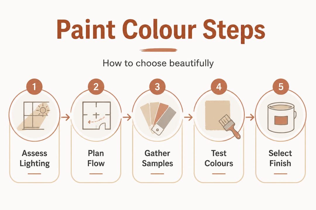
Prepare your space: assess lighting, flow and purpose
Now that you appreciate the high stakes of choosing the right colour, it is time to lay the groundwork for flawless results.
Before you open a single paint catalogue, walk through every room you plan to decorate and take notes. The direction your windows face is one of the most important factors in how a colour will behave. Rooms facing north receive cool, bluish light throughout the day, which can make warm creams look dull and grey tones feel icy. South-facing rooms are bathed in warm, consistent light and can handle almost any shade with confidence. East-facing rooms receive bright morning light that softens by afternoon, while west-facing rooms are dark in the morning but glow warmly in the evening. Lighting direction and time of day dramatically affect how the same colour reads across differently oriented rooms, even under evening lamps.
Here in the South West, we benefit from some of the most generous natural light in the UK, but coastal glare, overcast Atlantic skies, and the long summer evenings all add layers of complexity. A cool sage that looks beautiful in a Bristol showroom may appear completely different in a west-facing cottage sitting room in Cornwall at dusk.
Consider the purpose of each room as well. Kitchens benefit from energising, clean colours that feel hygienic and bright. Lounges call for warmth and comfort. Children’s bedrooms can handle bolder, more playful shades. The function of the space should guide the emotional register of your palette.
Key things to assess before buying a single pot:
The compass direction of every main window
Whether the room is open-plan or enclosed
The existing flooring and furniture tones
How much artificial lighting is used and what bulb temperature it uses
The purpose and mood you want the room to achieve
Room-to-room flow also matters enormously. If you walk from a deep navy dining room straight into a bright white kitchen, the contrast can feel jarring rather than considered. Think of your home as a connected visual journey, not a series of isolated decorating projects. For tailored South West UK painting ideas and inspiration specific to the region, it is worth exploring what works well in local properties.
Room direction | Light quality | Colour strategy |
North-facing | Cool, flat throughout the day | Warm whites, ochres, soft terracottas |
South-facing | Warm, generous all day | Works with almost any palette |
East-facing | Bright morning, cool afternoon | Light, fresh tones that lift early light |
West-facing | Dark mornings, warm evenings | Rich, deep shades that glow in the evening |
Pro Tip: Visit your rooms at three different times: mid-morning, mid-afternoon, and under artificial evening lighting. Take a photo at each point so you can compare how the light actually shifts.
Gather your tools: essentials for planning and sampling
Before making any final choices, it is essential to prepare all the right tools and materials for proper testing.
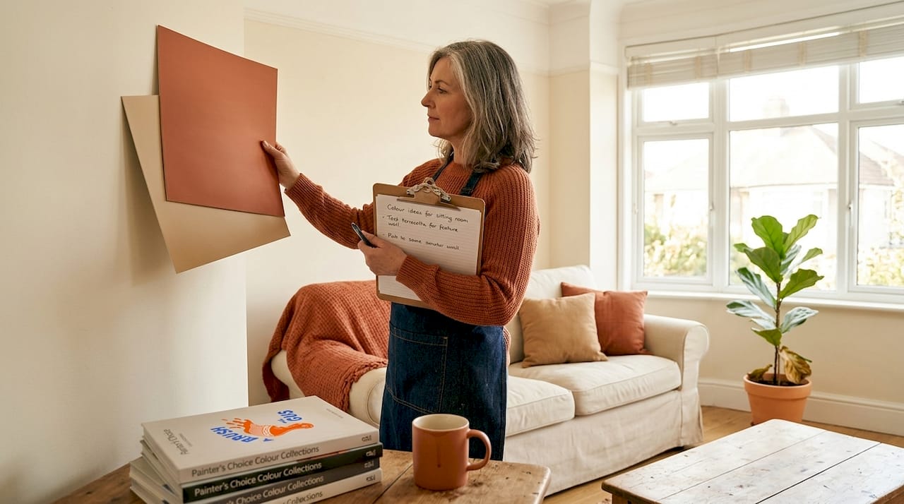
Far too many homeowners rely on tiny paper swatches or a single brush stroke to make a decision they will live with for years. The professionals who visit homes across the South West every week know that proper sampling takes a little more effort but saves enormous time and money in the long run.
What you need before you start sampling:
At least two tester pots per shortlisted colour
A large piece of white card or lining paper for sample boards
A notebook or spreadsheet to record colour names, brand codes, finish types, and lighting conditions tested
A paint visualiser app such as Farrow and Ball’s online tool or Dulux Visualizer for a rough digital preview
A colour planning sheet that maps each room, its direction, purpose, and shortlisted colours
Physical sample boards are far more reliable than digital tools alone. Paint two coats of each shortlisted colour onto a large piece of white card, at least A3 in size, and pin or lean it against different walls in the room. Understanding types of interior paints before you shop also helps you shortlist finishes at the same time as colours, streamlining the whole process.
Tool | Purpose | Reliability |
Paper swatch | Quick initial shortlisting | Low - colours read differently at scale |
Tester pot on card | Accurate colour reading under real light | High |
Paint visualiser app | Early-stage inspiration | Medium - useful but not definitive |
Large painted sample board | Definitive testing in situ | Very high |
The planning sheet is underrated. When you are juggling eight rooms, three finish types, and a partner with different opinions, having a written record of every decision prevents confusion, avoids costly double-ordering, and makes the conversation with your decorator far smoother.
Test, compare, and decide: smart sampling strategies
With tools in hand, you are ready to put your choices to the test and narrow down to the perfect shade.
Here is where most homeowners go wrong. They paint one small patch on a single wall, stand back for 30 seconds, and decide. That approach simply does not give you enough information. Here is a step-by-step process used by experienced decorators:
Paint large sample boards (at least A3 size) in each shortlisted colour and place them on multiple walls in the room, not just one.
Test at different heights. Place samples near the floor, at eye level, and close to the ceiling. Shades can shift noticeably depending on proximity to natural light sources.
Check at three distinct times of day: morning light, afternoon light, and evening under artificial lamps.
Compare against your existing furnishings and flooring. Hold a cushion, a rug, or a floor sample next to the colour board to assess real-world compatibility.
Live with it for at least 48 hours before committing. Colours that seem perfect on day one sometimes reveal undertones you had not noticed.
Photograph each sample under each lighting condition. Comparing photos side by side on a phone screen is surprisingly revealing.
“The same colour can read warmer or cooler depending on the room’s aspect and even under evening lamps, so always test across lighting conditions before committing to a full tin.”
Paper swatches are useful for building a rough shortlist but should never be the final decision-making tool. The paper itself affects how the colour looks, and small swatches simply do not give your eye enough information to judge correctly at room scale.
When you are ready to move forward, reviewing painting best practices can help ensure your preparation is thorough. If you want to understand how professionals approach sampling on larger projects, reading about professional painting techniques gives you useful context before a decorator visits.
Match paint finishes to room needs
Once you have chosen your colour, it is just as vital to select a paint finish that supports durability and cleanability in each space.

Colour and finish are equally important, yet finish is the factor homeowners most commonly overlook. The sheen level of a paint changes not just how it looks but how practical it is for each room.
Higher sheen levels increase scuff and stain durability but also highlight surface imperfections. Matte finishes, by contrast, are forgiving on older, textured walls but are harder to wipe clean.
A quick guide to finishes:
Matte: Best for ceilings and low-traffic bedrooms. Absorbs light, hides imperfections beautifully. Harder to clean.
Eggshell: A subtle sheen that works well in living rooms and bedrooms. Slightly more washable than matte.
Satin: Noticeably shiny with good durability. Ideal for hallways, children’s rooms, and kitchens.
Semi-gloss: Very durable and easy to clean. Best for trims, skirtings, and door frames.
High-gloss: Maximum durability and a mirror-like finish. Reserved for front doors, woodwork, and feature details.
Room | Recommended finish | Reason |
Bedroom | Matte or eggshell | Low traffic, relaxed atmosphere |
Living room | Eggshell or satin | Balance of warmth and washability |
Kitchen | Satin or semi-gloss | High traffic, grease and moisture present |
Hallway | Satin | Heavy use, needs to withstand knocks and scuffs |
Ceilings | Matte | Hides imperfections, no reflection needed |
Trim and doors | Semi-gloss or gloss | Durability and clean definition |
For in-depth guidance, choosing the right paint finish explores each option in detail. When it comes to application, painting walls like a pro covers the techniques that make the difference between a patchy finish and a flawless result.
Maintain cohesion and avoid common mistakes
Finally, to guarantee a polished, connected feel, it helps to learn from the most successful and unsuccessful paint projects we have seen across the South West.
The single biggest mistake homeowners make is treating each room as a completely separate project. You end up with a house that feels like five different decorators worked on it, each in a different decade. Visual cohesion comes from restraint and intention.
Consistent trim and ceiling colour creates continuity between rooms, with controlled intensity differences working best when the lightest shades are used in the most light-filled spaces and stronger tones reserved for darker areas.
Common mistakes to avoid:
Using more than three or four distinct wall colours across the whole house
Choosing a different trim colour for every room rather than one consistent neutral
Picking colours in isolation without considering how they read through open doorways
Ignoring the north vs. south orientation of rooms when selecting warm or cool tones
Using inconsistent finishes in adjacent rooms, which creates a disjointed feel
Relying on trend colours without checking whether they suit your home’s light
In open-plan spaces, use a consistent background shade with small intensity variations to define zones without creating visual breaks. A kitchen that flows into a dining area works beautifully when both areas share the same trim and ceiling colour, with the kitchen perhaps using a slightly cooler version of the same tone.
Statistic to consider: Research into home renovation satisfaction consistently finds that colour-related regrets are among the most commonly cited post-decoration complaints, with many homeowners wishing they had tested more samples and taken longer over the decision. For guidance on the most effective finish choices for each room, working through a structured plan before picking up a brush makes the process far less stressful.
The expert’s perspective: thinking beyond colour charts
With the main strategies covered, it is worth sharing what most home decorators overlook when they become absorbed in the search for the perfect shade.
In our experience working on homes across the South West, the clients who are happiest with the final result are rarely those who found the single most beautiful colour on the chart. They are the ones who thought about the bigger picture. They asked how one room would feel from another. They chose a calm, limited palette and resisted the temptation to add more.
Here is something counterintuitive: using the same white or off-white for every ceiling and trim throughout your home does not make it feel repetitive or bland. It makes it feel considered and complete. Varying your trims and ceilings from room to room, trying to be creative, is usually what creates a restless, unresolved feeling that is hard to put your finger on.
The obsession with finding the ideal shade also leads people to spend so long agonising over a single wall colour that they never think clearly about finish, flow, or the relationship between rooms. A calm, slightly muted palette executed consistently will almost always outperform a collection of individually stunning colours that have no relationship to each other.
Treating the palette as a flow system for open-plan homes, coordinating intensity and using trim and ceiling continuity to prevent jarring transitions, is exactly the approach that produces homes that feel effortlessly elegant rather than decorated. That principle applies even to smaller terraced houses and cottages in the South West, where rooms interconnect more than people realise.
If you want to understand how the professionals handle this in practice, looking into professional techniques for flow gives you a clearer picture of the decisions that happen before a single brush stroke goes on the wall.
Bring your dream palette to life with professional help
If you want your refreshed home to feel as seamless as a designer showcase, expert help is within reach.
At A Brush With Gus, Gus and Rhys bring years of hands-on experience transforming homes across the South West, from cosy Cornish cottages to spacious Devon family homes. Knowing the theory is one thing. Seeing it executed flawlessly by people who do this every day is another.

Whether you need domestic painting expertise for your interior rooms, a completely refreshed exterior with our professional exterior painting service, or a modern update to your windows and doors with our UPVC spraying specialists team, we can handle the whole project from initial colour consultation through to the finished coat. Get in touch for a free, no-obligation quote and let us help you get the look exactly right the first time.
Frequently asked questions
Does wall direction really affect paint colour appearance?
Yes, natural light changes throughout the day, making the same colour look warmer or cooler depending on whether the room faces north, south, east, or west.
How do I pick the right paint finish for my hallway?
Opt for satin or eggshell finishes in hallways, as higher sheen improves durability against scuffs and everyday knocks while still looking smart and well-finished.
Can using one colour throughout the house look boring?
Not at all. Using consistent intensity and trim colours across rooms creates a sophisticated, connected feel that is far more impressive than a patchwork of unrelated shades.
Is it really necessary to test paint with large samples?
Yes, large painted samples give you a far truer impression of how a colour behaves under different lighting conditions compared to small swatches or paper chips.
Do I need to use the same finish for walls and trim?
No, using different finishes is standard practice. Most decorators use matte or eggshell for walls and apply a higher sheen for trim and doors to create definition and ensure durability where it matters most.
Recommended
Comments