
UK Homeowners: 5cm × 5cm Samples for Kitchen Spray Colour Matching
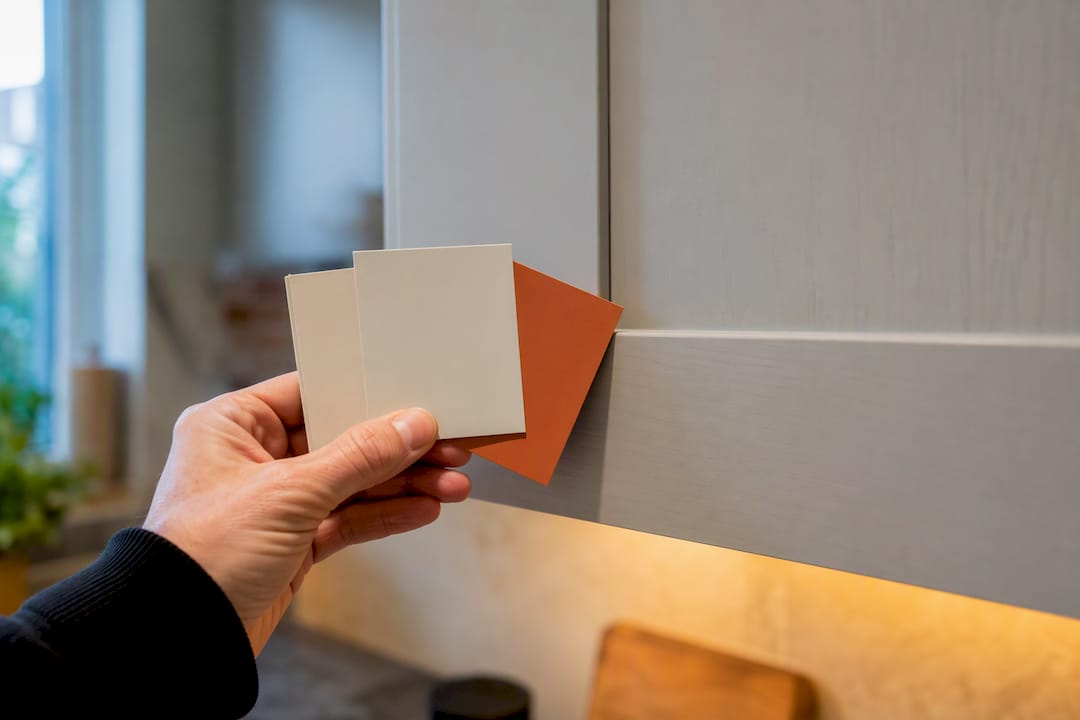
Yes, professional colour matching for sprayed kitchen cabinets works, and most colours can be replicated to a close, often indistinguishable degree. The catch is that accuracy depends entirely on what you supply: a proper dry sample, honest expectations about sheen, and the substrate underneath. Give a supplier a good sample and choose bespoke mixing when precision matters, and a costly guessing game becomes a controlled process.
TL;DR:
A proper dry sample of at least 5cm by 5cm significantly improves the accuracy of colour matching for kitchen cabinets.
Bespoke formulas, created by scanning samples and building custom recipes, are costly but offer far better precision than chart matches.
Visual conditions such as lighting, sheen, and substrate texture can cause a technically correct match to appear wrong in real settings.
Viewing samples under different lighting conditions and comparing large painted panels against existing materials reduces the risk of costly mismatches.
Professional spray finishing, including proofing and tailored application methods, is essential for achieving a seamless, long-lasting color match.
Table of Contents
What kitchen spray colour matching actually means
Colour matching splits into two very different processes, and confusing them causes most of the disappointment homeowners report after a respray.
A chart match means picking the nearest existing shade from a standard reference, such as the RAL colour system, Farrow & Ball, or Dulux. It is fast and cheap, but “nearest” can still be visibly off next to an existing door or worktop.
A bespoke formula is different. The supplier scans your actual sample and builds a colourant recipe designed to replicate it, not just approximate it, which is how WeSpray’s kitchen colour matching service works.
Two more things decide whether the finish “reads” correctly:
Sheen level (matt, satin, gloss) changes how identical pigment appears on the wall or door.
Film build, meaning how thick the paint layer is, subtly shifts perceived depth and colour.
How professional colour matching is performed
Suppliers generally run one of two workflows once your sample arrives, and understanding which one you’re getting changes what you should expect back.
Scan against a database. A spectrophotometer or colour scanner reads your sample and cross-references it against libraries such as RAL, NCS, or Pantone, returning the closest catalogued match. This is quick and usually inexpensive.
Scan and build a bespoke formula. The same scanning step feeds into custom colourant mixing rather than a database lookup, which is how WeSpray develops a bespoke recipe from a submitted sample. This route costs more and takes longer, but it closes the gap between “close enough” and “correct.”
Proofing. Reputable suppliers won’t ask you to commit blind. They’ll produce a small pot, a spray proof panel, or an aerosol sample for you to approve against the real cabinet or worktop before committing to a full respray.
Skipping that third step is the single most common reason homeowners end up repainting cabinets they’d already paid to have sprayed once.
What to provide for a reliable match
The sample you hand over does most of the work, and a weak sample is the fastest way to get a weak match.
Suppliers consistently prefer a dry painted panel or manufacturer swatch of at least 5cm × 5cm (roughly 2 inches square), which gives scanning equipment enough surface area to read accurately, a size commonly requested by colour-matching services. A phone photograph or a chipped paint flake rarely gives usable results, because screens distort colour and tiny fragments don’t hold enough consistent surface for a scanner.
Where you have them, these details speed things up and improve accuracy:
A RAL number, Farrow & Ball name, or Dulux name.
BS or NCS codes, or RGB/hex values if you have digital colour data.
The name of the branded range, since suppliers who’ve already matched dozens of Farrow & Ball or RAL shades can often work faster from a name alone.
Notes on the substrate: wood, laminate, UPVC, and metal all reflect and absorb pigment differently, so a match proven on one material may need a separate proof on another.
Why matches can still look wrong: undertones, light and sheen
Even a technically correct match can look off in your kitchen, and this is where most complaints originate.
Metamerism is the technical term for two colours that match under one light source but visibly diverge under another. A sample that looked perfect under a shop’s fluorescent tubes can shift noticeably under your kitchen’s warm-white LEDs or north-facing daylight.
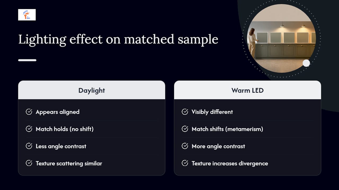
Pro Tip: Always ask to view your matched sample under at least two lighting conditions, ideally daylight and your kitchen’s actual bulbs, before signing off on a full respray.
Sheen plays a bigger role than most people expect. The same pigment mixed to satin versus gloss can genuinely appear to be a different colour once light hits it at an angle, so matching sheen is not optional if the result needs to sit seamlessly beside existing units.
Substrate texture also caps how close a match can get. Textured or porous surfaces scatter light differently to smooth factory finishes, and suppliers typically build in a tolerance rather than promise a pixel-perfect result. On heavily textured doors, this tolerance is worth asking about directly before you commit.
How to choose and test your matched colour before respraying
Getting a colour approved on paper is one thing. Getting it approved in your actual kitchen is another, and skipping this stage is where expensive mistakes happen.
Shortlist two or three candidates and get large painted samples, not tiny swatches, so you can judge them properly.
Hold each sample against your worktop, flooring, and hardware, since a colour that looks great in isolation can clash badly once placed beside fixed materials, a step designers consistently recommend.
Check every sample at different times of day, and separately under your kitchen’s own artificial lighting, noting whether your bulbs run warm or cool white.
Order a sprayed or aerosol proof panel from the supplier for anything where precision genuinely matters, rather than relying on a printed swatch card.
A few practical habits make this process far less painful:
Tape samples to the actual cabinet door, not a random wall, since surrounding colours change perception.
Note the LED colour temperature of your kitchen bulbs (warm white around 2700K reads very differently to cool white at 4000K).
Compare rival samples side by side rather than one at a time from memory.
Spray application factors that change whether a match reads as right
The colour recipe is only half the story. How it’s applied changes what actually lands on your cabinets.
Trade aerosol 2K systems like COLORCAN can be bespoke matched across standard colour libraries and give strong local touch-up results, but their film build and long-term durability differ from a full workshop-sprayed panel using proper airless equipment. That’s not a flaw, it’s a different tool for a different job.
A handful of variables shift the final hue regardless of how accurate the original formula was:
Paint viscosity and thinning ratio, which affect how evenly pigment lays down.
Nozzle type and spray pattern, which change film thickness across the surface.
Drying regime and ambient temperature during application.
Primer choice: a neutral primer reduces the substrate’s own colour bleeding through, helping the matched shade sit true rather than skewing warm or cool.
For small touch-ups specifically, matching sheen and testing your mix ratio on a hidden area first is standard trade practice before applying anything to a visible panel.
Practical tips from Abrushwithgus on collecting samples
We ask clients for a dry painted swatch wherever possible, never a phone photo, because screens and camera sensors both distort colour before a supplier even sees it.
The mistakes we see most often:
Sending a photo instead of a physical sample and assuming it’s close enough.
Accepting a chart-only match without requesting a sprayed proof first.
Approving a sample under kitchen spotlights alone, then being surprised when daylight changes everything.
Our approval routine is simple: sprayed proof panel, homeowner sign-off in writing, then documented options for any corrections before the full job goes ahead.
When bespoke matching earns its cost, and when it doesn’t
Bespoke matching is worth paying for when you’re matching existing cabinetry, reviving a heritage colour, or coordinating against a fixed textile like a blind or upholstery that can’t be replaced. In those cases, “close” isn’t good enough, and a chart match will always carry a visible risk of standing out for the wrong reason.
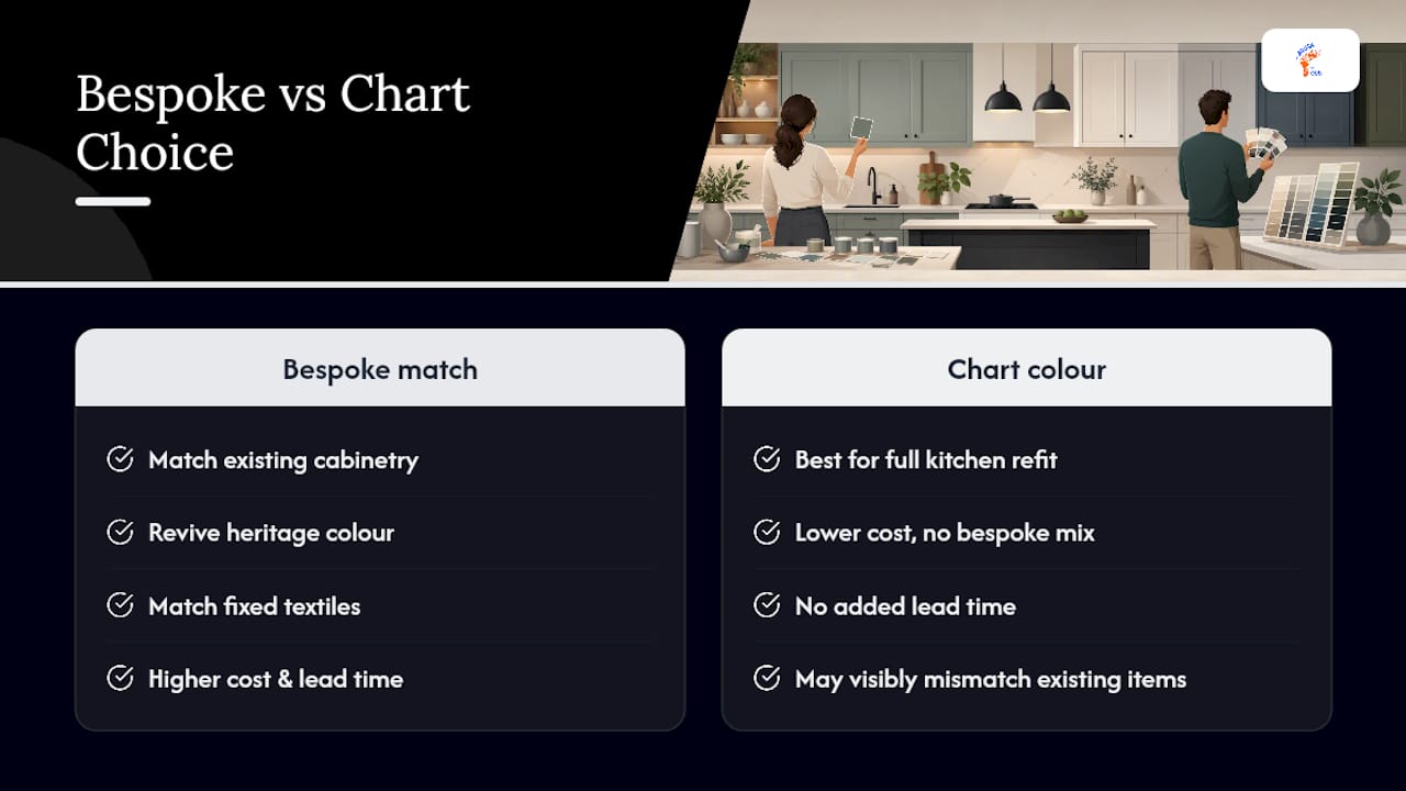
A standard chart colour makes more sense for a full kitchen refit, where every surface is changing at once and there’s nothing existing to match against. Budget matters too. Bespoke formulation and proofing add cost and lead time that a straightforward chart pick avoids entirely.
Whichever route you take, factor in the time a sprayed proof adds to your schedule. It feels like a delay in the moment, but it’s far cheaper than repainting an entire kitchen because a chart swatch didn’t translate to the real room.
— Angus
Getting your kitchen colour matched and sprayed properly
Abrushwithgus handles the part most homeowners find hardest: turning a sample, a swatch, or a colour name into a finish that actually matches once it’s on the cabinet. Rather than leaving you to guess between a chart colour and a bespoke mix, we run a proper on-site survey, collect the right sample, and arrange bespoke mixing before any spraying starts.

Our service covers on-site colour surveys, sample collection, bespoke colour matching, and professional spray application across cabinets and UPVC surfaces, so the same attention to sheen and substrate applies whether you’re respraying doors, frames, or a full kitchen run. Before you get in touch, pull together a dry sample if you have one, or note down the RAL, Farrow & Ball, or Dulux name you’re working from. During your quote, we’ll talk through substrate, sheen, and whether a sprayed proof makes sense for your project. Get in touch with our domestic services team to arrange a survey and see your matched colour on a proof before committing to the full respray.
Sources
For readers who want to explore reference systems directly, the RAL colour system and Farrow & Ball’s own palette are the two most commonly requested standards in the UK. WeSpray’s colour matching page is a useful example of how a bespoke matching workflow is presented to customers. For general colour selection principles beyond matching mechanics, our own guide on choosing paint colours for your home covers undertones and pairing in more depth.
FAQ
Can I get a colour match of paint in a spray can?
Yes. Trade aerosol 2K products can be bespoke matched to specific colour codes or samples, though their film build and durability differ from a full workshop-sprayed finish.
Do DIY stores do colour match spray paint?
Large DIY retailers typically offer chart-based tinting for tins rather than bespoke aerosol formulation. For a precise cabinet match, a specialist spray supplier or a bespoke matching service is the more reliable route.
What kitchen colours are popular in 2026?
Warm, muted greens, soft terracottas, and deep charcoal or bronze tones are strong choices this year, often paired with natural wood or stone worktops to soften the depth of colour.
What colour combinations work well in a kitchen?
Pairing a deep cabinet colour with a lighter worktop and warm wood accents tends to work reliably, as does contrasting matt lower cabinets with a lighter wall colour above; for more advice on colour and hardware pairing, see the best colour to paint interior doors. Testing large samples against your actual worktop and flooring, rather than trusting a swatch card alone, remains the most reliable way to confirm a pairing works.
Does Abrushwithgus offer bespoke colour matching for kitchens?
Yes. Abrushwithgus runs on-site surveys and sample collection to arrange bespoke colour matching ahead of professional spray application on cabinets and UPVC surfaces.
Recommended
Comments